
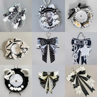
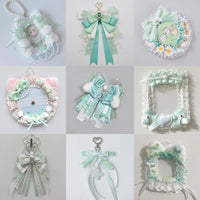
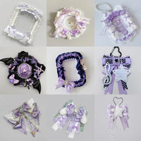
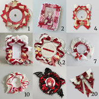

How to Build an Oshi Color Theme for Your Ita Bag
How to Build an Oshi Color Theme for Your Ita Bag
An oshi color theme is one of the easiest ways to make mixed merchandise feel like one collection. Instead of forcing every piece to match perfectly, choose a small palette and repeat it throughout the display.

Start with the merchandise you already own
Look at your favorite pins, photocards, charms and accessories before deciding on a palette. Which color appears most often? Which secondary color naturally supports it? Your existing collection can usually tell you what the theme should be.
Use dominant, support and accent colors
A simple three-role system keeps the display cohesive without making it flat.
Dominant color: the color that appears most often and defines the overall mood.
Supporting color: a second color that helps separate pieces and adds depth.
Accent color: a smaller pop used sparingly to keep the layout lively.

Build the palette from merch, not the other way around
If your collection contains several colors, group the pieces first and look for combinations that repeat naturally. Then choose accessories that reinforce those colors rather than introducing completely new ones.

Repeat color in different merchandise types
A color theme feels stronger when the same shade appears in different forms—for example across a photocard holder, pin, ribbon or charm. That repetition visually connects pieces that may have completely different shapes.
Keep the focal piece stronger than the palette
Color should support your oshi, not overpower them. Choose the hero item first, place it where the eye naturally lands, then use the palette to organize everything around it.
If you need help with placement, start with how to plan an ita bag layout. For a broader decorating workflow, see how to decorate an ita bag.
Browse all OshiHub ita bags to find a display shape for your next oshi color theme.