

Kawaii Ita Bag Ideas: Cute Layouts, Colors & Accessories
Kawaii Ita Bag Ideas: Cute Layouts, Colors & Accessories
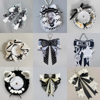
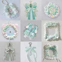
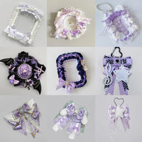
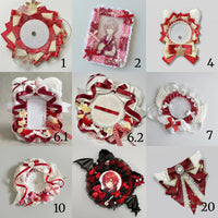
A kawaii ita bag works best when the display feels cute as a whole—not when every empty spot is filled. Start with a clear focal piece, repeat a small group of colors, then use bows, rosettes and smaller accents to frame the collection.

Choose a simple visual direction
Pick one idea before arranging the merch: soft monochrome, pastel contrast, character-first, or a repeated motif. A clear direction makes it much easier to decide which accessories belong in the display and which ones can stay out.
Use bows and rosettes as framing pieces
Bows and rosettes can add softness and texture, but they are strongest when they support the main merch. Place larger decorative accents near the edges or around the focal piece instead of covering important character art.

Repeat colors instead of adding more colors
A cute layout does not need every pastel shade at once. Repeating a few colors across pins, holders, ribbons and charms creates a stronger theme and helps mixed merchandise look connected.
Leave breathing room
When every gap is filled, small details can disappear. Leaving some open space around a favorite photocard, pin or charm gives the eye a place to rest and makes the hero piece easier to notice.

Three easy kawaii layout recipes
Soft monochrome: one main color in several shades with matching decorative accents.
Character shrine: one hero piece in the center, smaller related merch around it and repeated bows or motifs near the edges.
Pastel contrast: two coordinated colors repeated across different merchandise types instead of scattered randomly.
For the basic structure behind any display, read how to plan an ita bag layout and how to decorate an ita bag.
Browse all OshiHub ita bags to find a display shape that fits your collection.