

Symmetrical vs Asymmetrical Ita Bag Layouts: Which Looks Better?
Symmetrical vs Asymmetrical Ita Bag Layouts
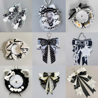
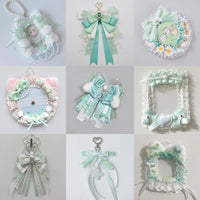
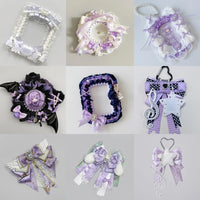
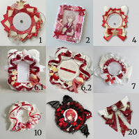
Symmetry feels organized immediately. Asymmetry feels more dynamic. Neither is inherently better—the right choice depends on the shapes and repetition already present in your merch.

Mirror it—or balance the weight
A symmetrical display mirrors visual weight across a center line. An asymmetrical display balances different objects without mirroring them. Balanced does not always mean identical.
Matched positions
Repeated badges, matching rosettes and paired photocards naturally suit a mirrored structure.
Strength: calm, clear and organized.
Matched visual weight
A large photocard on one side can be balanced by several smaller pins or charms on the other.
Strength: flexible and energetic.

Why repeated badges love symmetry
When the same badge shape repeats, your eye naturally notices rows, columns and equal spacing. That makes symmetry especially satisfying.
Think in visual weight, not item count
Large size, dark color, high contrast and complex artwork all feel visually heavier. One large dark photocard can balance several smaller bright pins. You do not need the same number of objects on both sides.
A practical middle ground
Use a symmetrical foundation—such as a centered photocard and equal pin rows—then break it with one charm or accent. The structure stays readable while the display avoids feeling too rigid.

Match the layout to your merch
| Merch collection | Good starting structure |
|---|---|
| Repeated badges | Symmetrical grid |
| Mixed cards + pins + charms | Asymmetrical |
| Two matching rosettes | Symmetrical |
| One oversized hero piece | Asymmetrical |
| Multi-window bag | Either; balance each panel |
Build one symmetrical version and one asymmetrical version on the loose insert, photograph both, and compare them at thumbnail size. For a fuller process, see How to Plan an Ita Bag Layout. If repeated badges keep rotating after you place them, follow How to Keep Ita Bag Pins Straight.