Green Ita Bag Ideas: Mint, Nature & Fresh Oshikatsu Displays
Green can feel bright, botanical, soft or dramatic depending on the value. Choosing the green mood first makes it much easier to select holders, ribbons and filler without turning the display into a mix of unrelated shades.
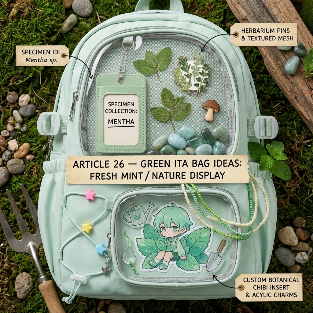
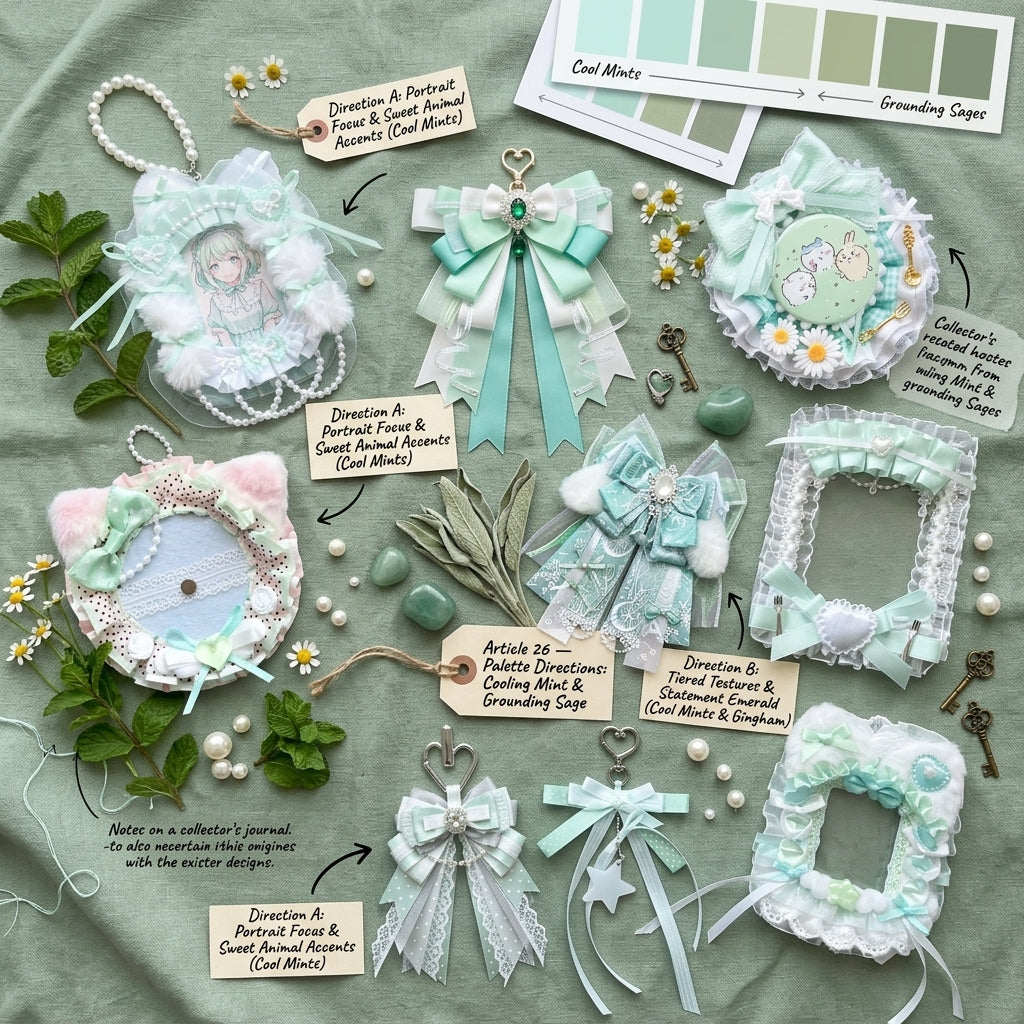
Choose the green mood before choosing filler
Mint supports cute, bright displays. Sage works naturally with cream, brown and softer nature-inspired styling. Deeper greens can anchor high-contrast character art when lighter shades feel too delicate.
Fresh mint
Pair mint with white, pale yellow or transparent accents for a light collector look. Keep darker green to a few small anchors so the display still feels airy.
Soft sage
Use cream, beige and muted botanical motifs for a calmer display. Sage works well when the character art includes softer costumes, café scenes or natural backgrounds.
Nature motifs
Leaves, flowers, frogs, forests and picnic details can create a theme without requiring identical merch colors. Repeat one motif instead of trying to match every object to the same green.
Keep contrast
Dark green cards or badges need lighter holders or spacing so details remain visible. Clear or cream edges can separate neighboring items without introducing another strong color.
Three green display directions
Mint kawaii
Use mint as the main color, white as the neutral and one small yellow or pink accent if it already appears in the character art. Rounded holders and transparent charms reinforce the light feeling.
Botanical sage
Combine sage with cream and brown, then repeat leaves or flower shapes. Keep the merchandise itself as the hero; botanical decorations should connect the composition rather than cover empty space.
Deep green contrast
Use darker green as an anchor around vivid art, then add white or pale neutral spacing. A limited amount of metallic hardware can add definition without changing the palette completely.
Let the merch decide whether green is dominant or supporting
If most of your character art already contains green, the bag and holders do not all need to repeat the exact shade. A neutral holder can create enough separation while the bag still supplies the green frame. If the merch contains very little green, repeat the bag color in two or three smaller accents so the display feels connected.
For composition and spacing, see the Ita Bag Layout Guide. For holders and decorative accents, browse Ita Bag Accessories.
Build the palette on a green bag
Browse Green Ita Bags to compare green variants and window layouts. Keep the collection page focused on choosing a bag, while this guide helps you decide how the display palette should work.
If your merch mixes several hues, use the Ita Bag Color Guide before choosing the base color and supporting accents.
Green palette shortcut
Choose mint, sage or deep green as the dominant role, then add one neutral and one small secondary accent. Keeping those roles clear prevents a green display from becoming a collection of similar-but-competing shades.