

Ita Bag Color Guide: How to Choose a Bag Color That Makes Your Merch Stand Out
Ita Bag Color Guide: How to Choose a Bag Color That Makes Your Merch Stand Out
The same collection can feel cute, dramatic, calm or energetic depending on the bag color around it. The easiest way to choose is to start from the merch you already own—not from a bag color viewed by itself.


Pull your palette from your favorite merch
Lay out the cards, badges, acrylics and charms you care about most. Look for the one or two colors that repeat across character hair, outfit details, logos, card backgrounds or accessory art. Those repeated colors are better clues than trying to match every item perfectly.
Use a main color, a neutral, and one accent
You do not need every item to be the same shade. A simple three-part palette is easier to control:
Main color
The color that represents the character or dominates the merch. Repeat it across the bag, insert or several accessories.
Neutral
Black, white, cream, gray or another quiet tone gives the eye somewhere to rest and keeps mixed merch readable.
Accent
A smaller contrasting color can come from eyes, costume details, logos, ribbons or one standout charm.
Metal detail
Gold, silver or colored hardware can act as a finishing detail without becoming another full palette color.
If the display still looks noisy, remove one accent color before buying more decorations.
Four ways to choose the bag color
Direct match
Choose a bag close to the dominant merch color for a unified character-focused display.
Analogous palette
Choose a neighboring hue—such as blue with purple—to keep cohesion while adding more depth than an exact match.
High contrast
A darker or complementary bag can make pale, bright or metallic merch separate more clearly from the frame.
Neutral frame
Black, white or cream is useful when your collection already contains many colors and you do not want the bag to add another competing hue.
What color ita bag should you get?
Use this quick decision rule:
- Your merch is mostly one character color: match that dominant hue for a strong themed look.
- Your merch is very colorful: use a neutral bag to frame it.
- Your merch is pale or pastel: choose a similar pastel for softness or a dark neutral for stronger contrast.
- You want one bag for several characters: prioritize a versatile neutral or a color shared by multiple pieces.
- You plan to wear the bag often: include your normal wardrobe in the decision, not only the insert.
Bag color vs insert color: they do not have to match
The insert is closer to the merch than the outer fabric, so it can do more of the color-balancing work. A black bag can use a pink, blue or patterned insert; a bright bag can use a neutral insert to stop the display from becoming too saturated.
This also makes one bag more flexible: swap the insert when you change character or color theme instead of replacing the whole bag.
Use accessory colors to support the merch—not compete with it
Photocard holders, badge frames, rosettes and ribbon bows can reinforce a color theme, but the bag already provides a large block of color. Use accessories to create contrast and hierarchy rather than making every element the same shade.
Black displays
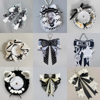
Use silver, white or cream for readability. Red or deep purple can work as a controlled accent, while clear low-profile holders let colorful merch stay dominant.
Red displays
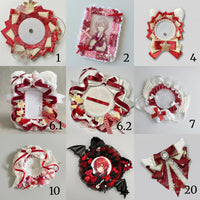
Black creates drama, white adds breathing room, and gold or silver can add a selective metallic accent. If you stay monochrome, vary the red from burgundy to bright red so layers remain visible.
Purple displays
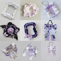
White keeps lavender themes clean; silver supports galaxy or magical themes; pink softens the palette; blue creates a dreamy gradient; and black pushes the display toward gothic.
Mint green displays
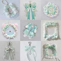
White and cream preserve a fresh airy look. Soft pink or lavender can add a pastel accent, while a deeper green gives pale merchandise more definition.
A useful rule is bag color + one supporting color + one neutral. Pick one hero accessory, then keep the rest smaller so holders and bows do not compete with the actual collection.
Browse OshiHub photocard and pin holders and compare accessory colors against your real merch, not just the empty bag.
Browse OshiHub ita bags by color
Compare Pink Ita Bags, Purple Ita Bags, Yellow Ita Bags, Green Ita Bags, Blue Ita Bags, Red Ita Bags, and Black Ita Bags.
For actual themed layouts, continue with Pink Ita Bag Ideas, Purple Ita Bag Ideas, Black Ita Bag Ideas, or the Ita Bag Layout Planner.
Color-matching FAQ
Should an ita bag match the character exactly?
No. Repeating one or two character colors is usually enough. Neutral space and deliberate contrast can make the character merch stand out more than an exact head-to-toe match.
Is black a good ita bag color?
Black is useful for bright, metallic and mixed-color merch because it creates a strong neutral frame. It is also easier to reuse across different character themes.
Can the bag and insert be different colors?
Yes. Treat the insert as the immediate background for the merch and the bag as the outer frame. Using different colors can create better contrast and makes themes easier to swap.