Purple Ita Bag Ideas: Galaxy, Dreamy & Magical Oshikatsu Displays
Purple can move from soft lavender to deep violet without losing cohesion. The easiest way to keep a purple ita bag readable is to give different purple values different jobs, then use one neutral to separate the merchandise.
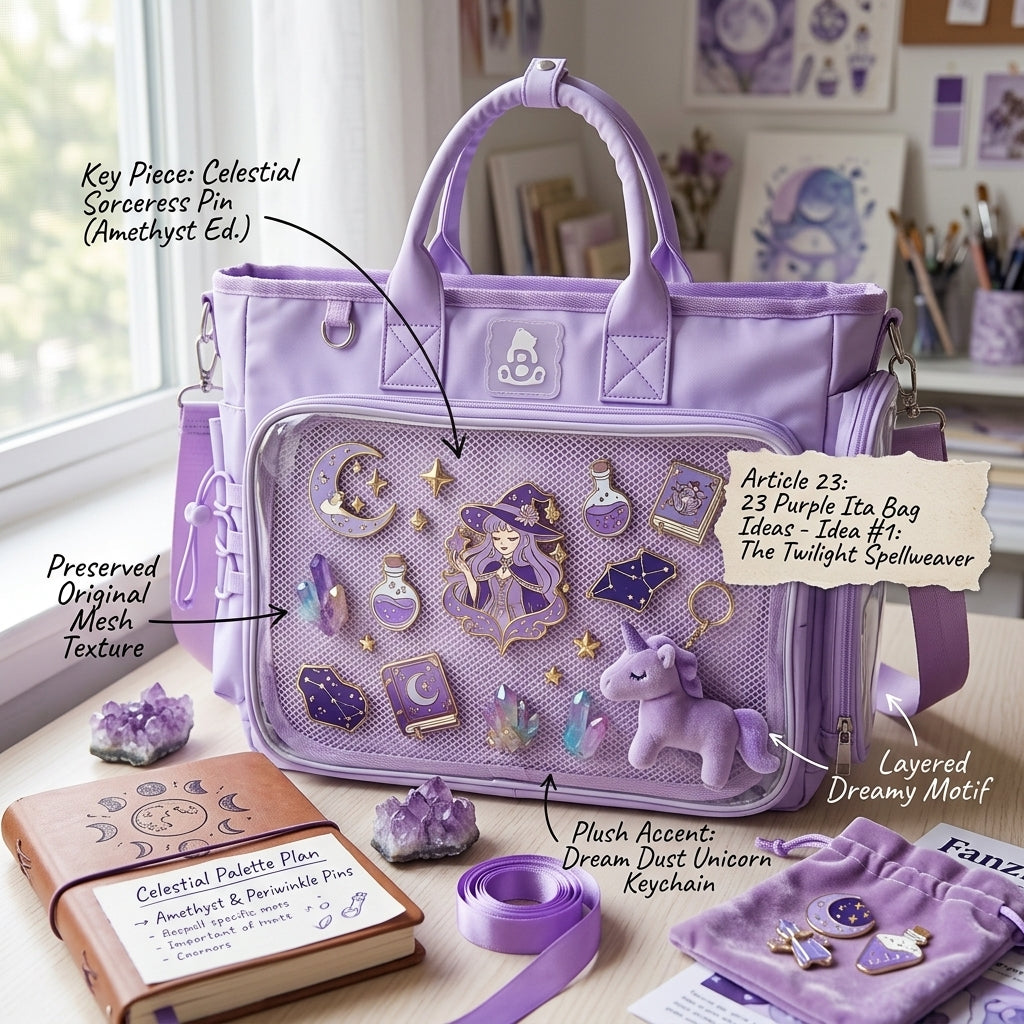
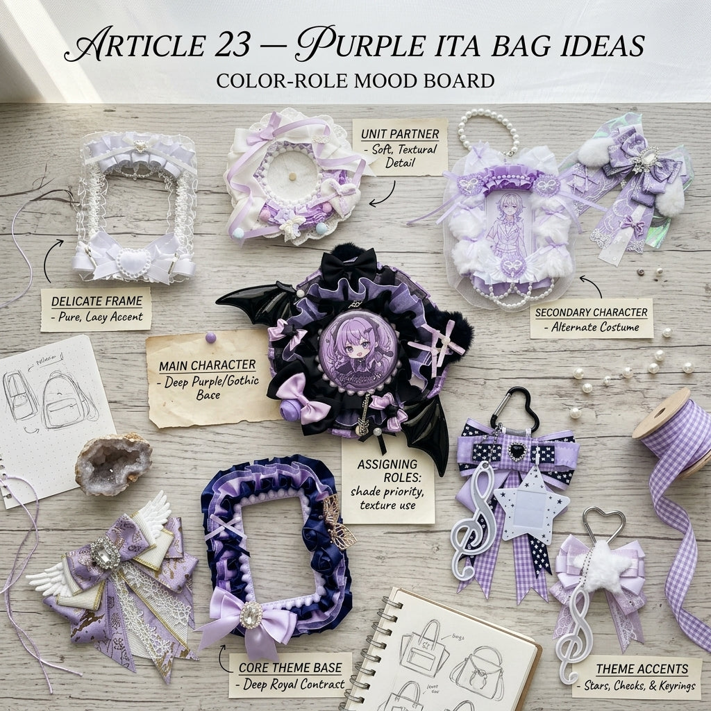
Give each purple shade a job
Let lavender provide softness, mid-purple connect the collection and deep violet create anchors or edge contrast. This creates depth without making every holder, ribbon and badge compete at the same intensity.
Dreamy lavender
Use lighter holders, stars, moons and translucent details for a soft magical look. White or clear accessories help pale character art stay visible instead of disappearing into the background.
Deep violet
Darker accents add drama and work well around high-contrast character art. Use deep violet around the edges or behind one focal piece instead of filling every gap with the darkest shade.
Silver and white
Small neutral highlights keep the purple palette from becoming visually muddy. Silver works naturally with celestial themes, while white creates stronger separation around faces and text-heavy photocards.
Repeat celestial shapes
Stars, moons, sparkles and crystal-like details can connect badges, holders and charms even when the merchandise itself uses slightly different purples.
Three purple display directions
Galaxy
Start with deep violet, add black or navy sparingly, then use silver or white as tiny points of light. Leave some open space around the main character art so the darker palette does not feel heavy.
Dreamy pastel
Use lavender as the dominant tone, pair it with white or clear holders, and keep decorative pieces soft and rounded. One pale pink or blue accent can work if it already appears in the character art.
Magical contrast
Use one saturated purple as the anchor, then add a light neutral and one metallic accent. This works well when the merch contains costumes, magical effects or highly detailed illustrations.
Plan the focal point before adding filler
Choose the item you want noticed first—often one photocard, large badge, or acrylic piece—and position it before adding smaller decoration. Then repeat the main purple in two or three supporting locations. If every empty space gets another purple object, the display can lose hierarchy.
For spacing and focal-point planning, use the Ita Bag Layout Guide. If you are mixing several merch types, the Ita Bag Accessories collection can help you compare holder and accent options.
Build it on a purple base
Browse Purple Ita Bags to compare purple bag shapes and clear-window formats. The collection page is the shopping destination; this guide is for deciding how to coordinate the display after you choose the base.
If your merchandise mixes lavender, violet and other accent colors, use the Ita Bag Color Guide to decide which color should dominate and which should stay secondary.
Quick purple palette rule
Start with two purple values plus one neutral. Add a fourth color only when it already appears repeatedly in the character art. That simple limit keeps a magical purple display cohesive while still leaving room for different merch formats.