A gothic ita bag can feel dramatic without becoming visually chaotic. The key is to use dark colors as structure, not filler: choose one dominant base, one supporting color, and one smaller metallic or light accent so the character art stays easier to read.
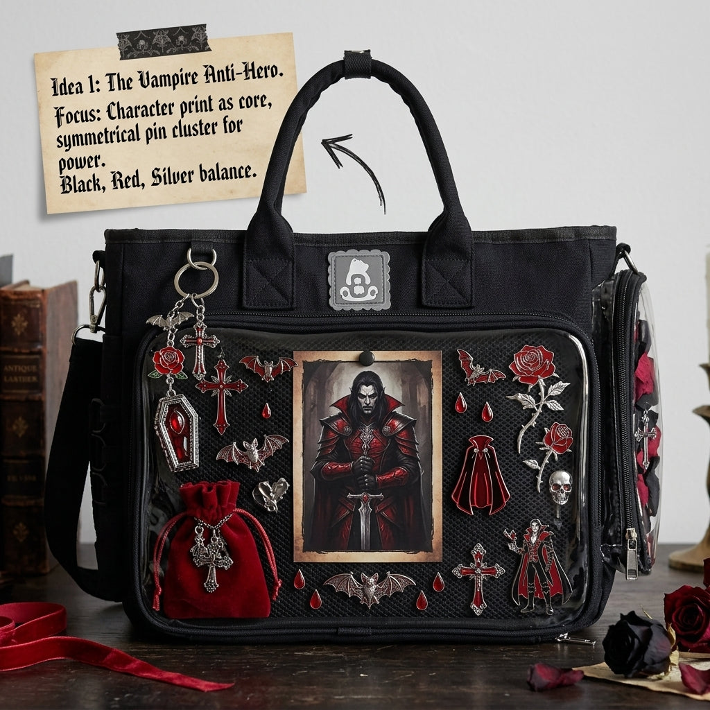
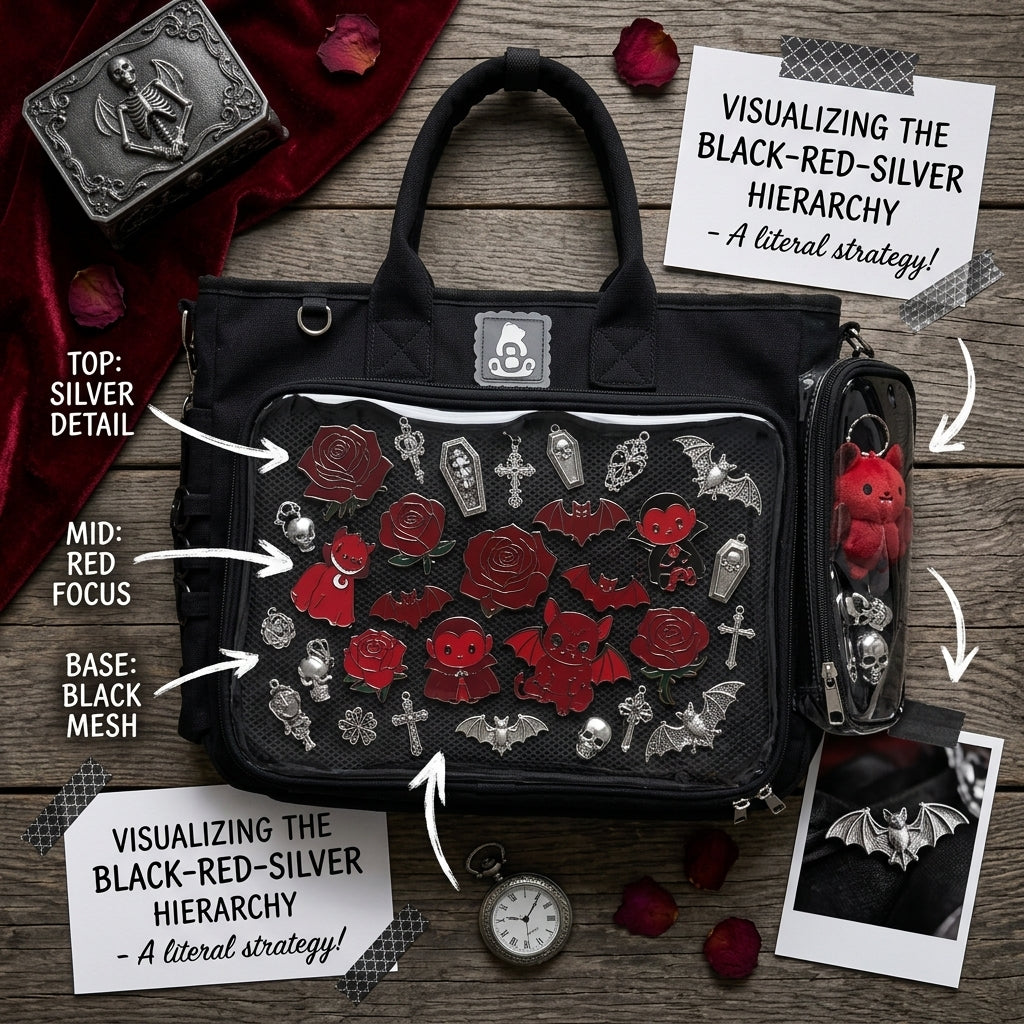
Start with a black-red-silver hierarchy
Black is a natural gothic base because it can frame many merch styles without introducing another competing hue. Red adds visual energy, while silver can separate dark objects or echo metal hardware. You do not need equal amounts of all three.
A simple hierarchy is:
- Black: the visual base or largest supporting area.
- Red: repeated in selected holders, ribbons, badges or artwork.
- Silver: a smaller accent for edges, chains, hardware or reflective details.
If the character art is already mostly black and red, leave more breathing room or use a light neutral around the face so the merchandise does not merge into the background.
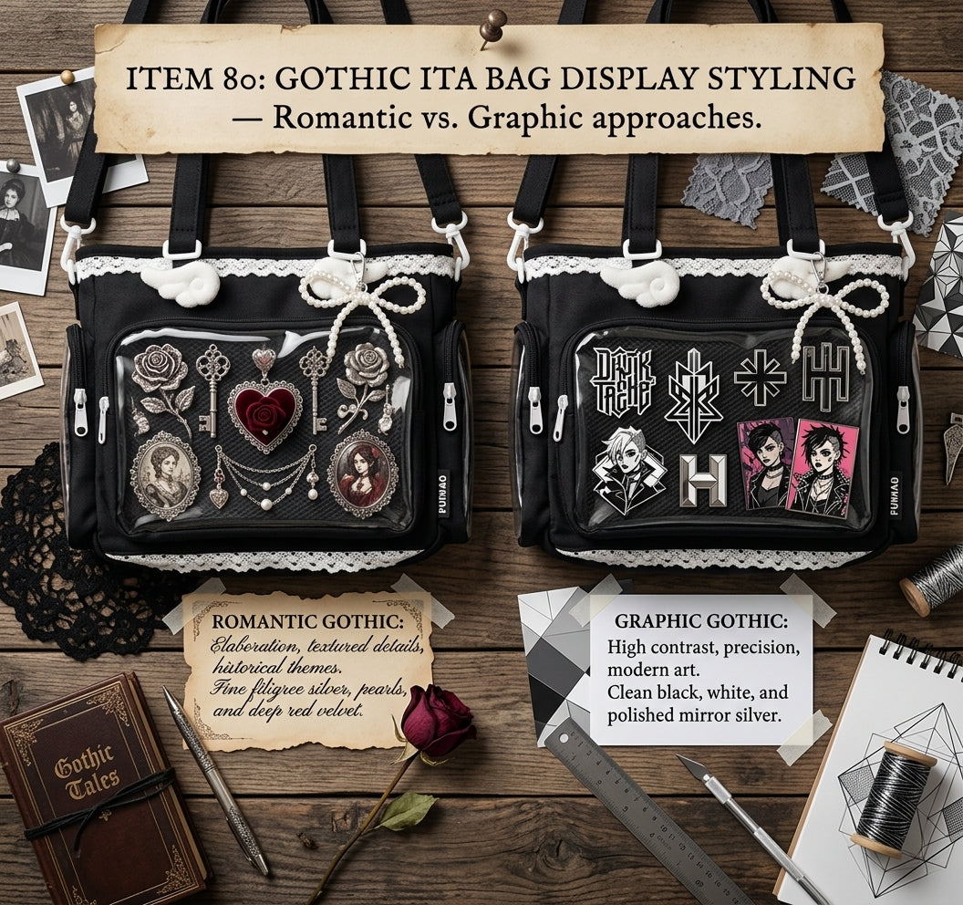
Romantic gothic vs graphic gothic
Romantic gothic
Use softer curves, ribbons, lace-like shapes, roses, ornate frames or rosette-style holders. Deep red and black can stay dominant, while silver or cream is used sparingly to separate details. A centered photocard or badge often works well as the focal piece because the surrounding decoration can form a frame around it.
Graphic gothic
Use straighter alignment, stronger repetition and clearer blocks of contrast. Repeated badges, symmetrical rows, chains and geometric holders can make the display feel sharper. Keep decorative pieces more controlled so the repeated merchandise stays easy to scan.
Choose the focal item before adding dark filler
Dark displays can become visually dense quickly. Pick one item that should be noticed first, then build outward from it. That could be a photocard, large badge, acrylic piece or rosette. Smaller items should support the focal point instead of competing with it.
If you are unsure where the main piece should sit, use the Ita Bag Layout Guide before attaching the final pieces.
Use contrast around faces and text
Character faces, signatures and small text are usually the first details to disappear in a dark palette. If a card has a black background, avoid placing it directly against another equally dark holder unless the edges remain clear. A silver, white, transparent or lighter red border can create enough separation without changing the gothic direction.
Build the theme from the bag color
If you want the bag itself to carry most of the dark tone, browse Black Ita Bags. If you want the base to contribute more visual intensity, compare Red Ita Bags. Both can support gothic styling, but the surrounding merch may need different contrast depending on which color becomes the frame.
For broader dark styling examples, see Black Ita Bag Ideas. If red is doing most of the visual work, see Red Ita Bag Ideas.
Add accessories only after the main structure works
Ribbons, rosettes, chains and decorative holders can strengthen a gothic display, but they work best after the main merch hierarchy is already clear. Use the Ita Bag Accessories collection to compare holders and accents, then choose pieces that repeat the existing palette instead of adding a new one.
Quick gothic display formula
Start with one hero item, repeat black or red in two or three supporting positions, add a smaller silver highlight, and stop before every empty area is filled. A gothic ita bag can still use negative space; the darker palette often looks stronger when the focal merch has room around it.