Red Ita Bag Ideas: Bold, Dramatic & Character-Focused Displays
Red naturally creates strong visual energy. The challenge is not making a red display more intense—it is controlling where that intensity goes so the character or favorite merch stays the focal point.
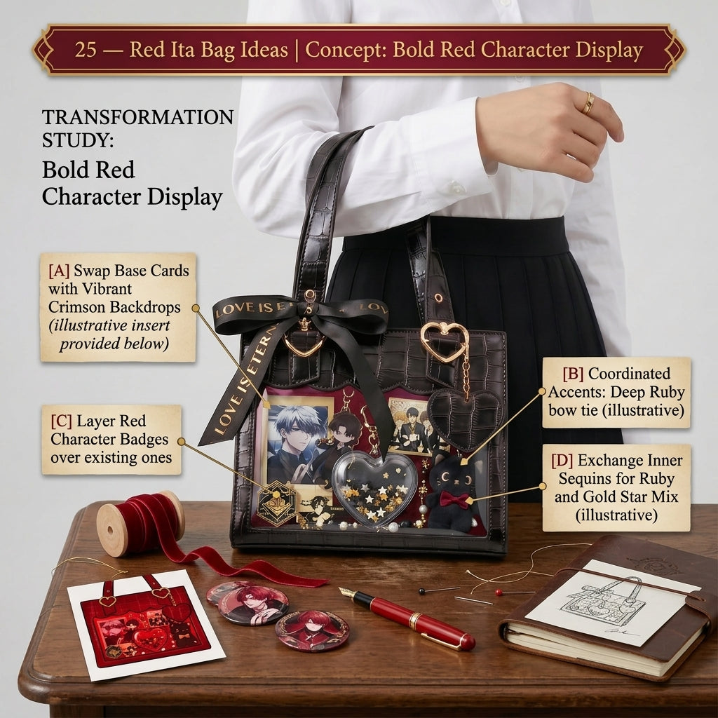
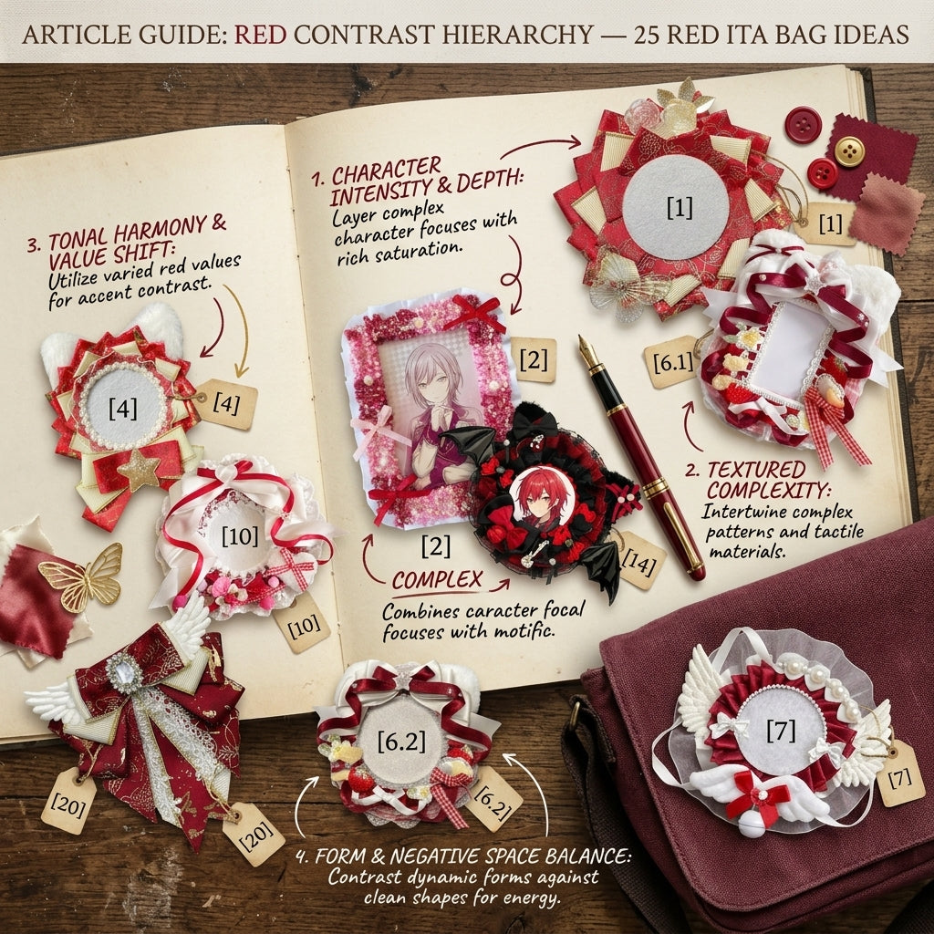
Do not give every red element the same visual weight
Choose one hero area, use medium red elements as support, and reserve the deepest or brightest reds for smaller accents. A controlled hierarchy makes red feel intentional instead of crowded.
Bold direction
Use black, metallic hardware and sharper graphic motifs for a dramatic display. Black is most effective as a separator or frame rather than an equal competitor to the red.
Romantic direction
Use cream, ribbons, roses or softer red tones to make the same color feel warmer. A small amount of pink can bridge bright red and pale neutrals when the character art already contains both.
Keep faces readable
Do not place red-on-red artwork next to similarly saturated holders without a separator. White, cream, black or clear space can restore the edge around a face or photocard.
Repeat red selectively
Three or four strong repeats usually feel more deliberate than filling every empty space with red. Repeat the color in different sizes rather than using identical red blocks everywhere.
Three ways to build a red display
Character-first
Start with one portrait or favorite badge, then use red holders and ribbons around it. Keep decorative pieces lower in contrast than the hero item so the face remains the first thing people see.
Graphic black-and-red
Use black as a structural color for holders, outlines or a small number of badges. Add white or silver in tiny amounts if the dark areas begin blending together.
Red-and-cream romantic
Use cream to soften the palette and make decorative pieces such as ribbons or floral shapes feel lighter. This works especially well when the merch includes uniforms, café themes or softer illustration styles.
Use spacing as part of the color palette
A powerful color does not need to cover the whole window. Leaving visible gaps around one hero photocard or badge group can make the red feel stronger because the eye has somewhere to rest. If you are building a repeated badge wall, separate rows carefully so the pattern stays readable.
For layout planning, use the Ita Bag Layout Guide. For holders, ribbons and other display accents, browse Ita Bag Accessories.
Choose the red bag around the display
Browse Red Ita Bags to compare available bag shapes and window formats. Keep the shopping intent on the collection page; use this article to decide how the merchandise should be styled once the bag is chosen.
If the collection mixes strong colors, use the Ita Bag Color Guide before deciding whether red should be the dominant color or a supporting accent.
Fast red formula
One hero character + repeated red accents + one contrast color is enough for a strong red ita bag theme. Add decorative filler only after those three roles already feel balanced.