
How to Match Photocard Holders to Your Ita Bag Color
Share
A photocard holder sits around the artwork, so its color can either help the card stand out or make it disappear. The easiest way to choose a holder is to decide what relationship you want between the bag, holder, and card.
Option 1: same-color match
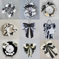
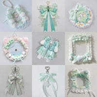
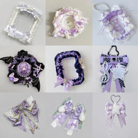
Use a holder in the same general color family as the bag. This creates a monochrome frame and works well when the photocard artwork already has strong contrast.
Option 2: lighter or darker shade
A pale holder on a dark bag—or a dark holder on a pale bag—keeps the palette related while adding definition around the card.
Option 3: match the oshi color instead of the bag
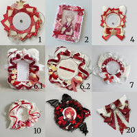
If the bag is neutral, let the holder carry the character’s signature color. Repeating that color in bows or pins connects the whole display.
Option 4: neutral holder
White, cream, black, or clear holders are useful when the card artwork already contains many colors. Neutral framing reduces visual competition.
Option 5: complementary accent
Use a contrasting holder to make one hero card stand out. Keep the rest of the display more restrained so the contrast looks intentional.
Test with the actual card
Do not choose a holder by bag color alone. Place the card inside or behind the holder and compare the combined result against the bag. A beautiful holder can still clash with the artwork.
Repeat the rule
If you use several holders, keep the same relationship across them. For example, all holders can be one shade lighter than the bag, even if the cards themselves vary.
For broader palette planning, read How to Match Ita Bag Color to Your Merch Collection.
Bottom line
Match holders by a deliberate relationship, not by exact color alone. Same family, controlled contrast, oshi color, or neutral framing can all work when the choice is repeated consistently.