
How to Match Ita Bag Color to Your Merch Collection
Share
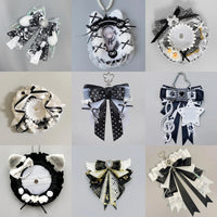
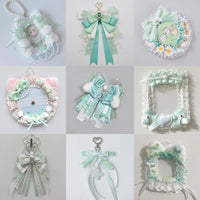
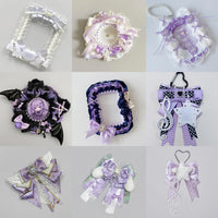
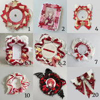
The best ita bag color is not always the color that appears most often in your merchandise. A good bag color can match your oshi, frame the display, increase contrast or quietly connect pieces from different releases.
Instead of trying to find one exact color match, decide what job you want the bag color to do.
Option 1: match your oshi's signature color
This is the most direct approach. If your character, idol or group member has a strong signature color, choosing a similar bag color makes the theme readable before someone even looks closely at the merch.
Exact matching is not necessary. A pink collection can work with blush, rose or deeper pink as long as the undertone feels compatible. Small shade differences often create more depth than a perfectly uniform wall of one color.
Option 2: use a neutral bag as a frame
If your merch contains many colors, a neutral bag can prevent the whole display from competing with itself. Black, cream, white or another quiet neutral gives the collection a stable border while the artwork remains the focus.
This is especially useful when you collect multiple releases with different palettes, or when the display changes often. A neutral base can survive more theme changes than a highly specific color.
Option 3: choose contrast instead of matching
Sometimes the merch becomes easier to read when the bag is darker or lighter than the collection. Pale photocards can stand out against a deeper bag, while dark badges may look cleaner against a light insert and body.
Think in terms of lightness as well as hue. Two different colors can still blend together if they have almost the same value. A quick phone photo converted to grayscale can help reveal whether the major shapes remain separated.
Option 4: pull a secondary color from the artwork
If the main character color is too dominant, look for a repeated secondary color in clothing, logos, borders or backgrounds. Using that secondary color for the bag can make the collection feel coordinated without looking overly literal.
For example, merch dominated by pink artwork with small blue accents can work well in a blue bag if those blue details repeat across several pieces.
Use a simple three-color rule
When a collection feels visually scattered, try organizing it into three roles:
- Base color: the bag and/or insert.
- Main merch color: the color family that dominates the collection.
- Accent color: a smaller repeated color used in holders, ribbons or charms.
The colors do not need equal representation. The purpose is to create repetition so the eye can connect separate pieces.
Check the clear window before deciding
The bag body is only part of what viewers see. The insert color, clear-window size and amount of empty space can change the final effect. If most of the bag body is hidden behind a large display window, the insert may have more visual influence than the exterior color.
For a broader overview, see the Ita Bag Color Guide. You can also explore Pink Ita Bag Ideas, Blue Ita Bag Ideas, Purple Ita Bag Ideas, Red Ita Bag Ideas and Black Ita Bag Ideas.
Test before you commit
Lay the merch on the insert, place it behind the clear window and take one photo from normal viewing distance. If the focal items disappear, change either the bag/insert contrast or the arrangement before adding more decoration.
Color matching works best when it supports the collection rather than controlling it. Start with the merch you care about most, then choose the bag that helps those pieces read clearly.
Browse all OshiHub ita bags to compare different bag colors, display-window sizes and carry styles.