
Monochrome Ita Bag Ideas: One-Color Displays With Depth
Share
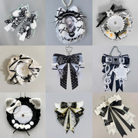
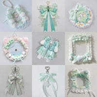
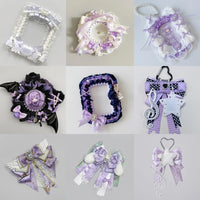
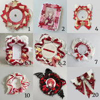
A monochrome ita bag uses one main color family, but that does not mean every item should be exactly the same shade. The best one-color displays use changes in lightness, texture, scale and spacing so the collection feels layered instead of flat.
This approach works especially well when your oshi has one signature color or when you want a clean display built from merchandise collected across different releases.
Choose a dominant color family, not one exact shade
Start with a broad color family such as black, purple, blue, red or pink. Then allow several related shades inside that family. A black display, for example, can include charcoal, true black, smoky gray and small silver details. A purple display can move from pale lilac through violet to deep plum.
This gives you more freedom to use the merch you already own while keeping the overall impression monochrome.
Build a light / mid / dark value ladder
Separate your merchandise into three rough groups: light, mid-tone and dark. You do not need equal amounts of each. One value can dominate while the others create separation.
If the insert and bag are dark, lighter photocards or badge backgrounds can become focal points. If the bag is pale, deeper versions of the same color can outline the display and prevent individual pieces from disappearing into the background.
A useful test is to look at the display from a few steps away. You should still be able to identify the main clusters even before reading the details on each piece.
Use texture to create depth without extra colors
Texture is one of the easiest ways to make a monochrome display feel rich. Combine smooth photocards, glossy badges, matte ribbons, embroidered rosettes, acrylic charms and fabric bows while staying inside the same color family.
Because the surfaces catch light differently, the display gains contrast without needing a second strong color. This is especially useful for black or white themes, where small material differences can do more work than extra decoration.
Repeat shapes, but break the pattern deliberately
Repeated round badges can create a clean pin wall, while repeated card shapes can create a more graphic grid. Once the pattern is established, use one larger or differently shaped item as the focal point. The interruption gives the eye somewhere to land.
For a deeper look at repeated layouts, see Repeated Badge Ita Bag Layouts and Symmetrical vs Asymmetrical Ita Bag Layouts.
Control metallic and neutral accents
Small neutral details do not automatically break a monochrome theme. Silver hardware, clear acrylic edges, white text or black outlines can act as structural accents. Keep them secondary so the chosen color still reads first.
For example, a red monochrome layout can use small black outlines to define shapes, while a purple layout can use silver hardware as a cool accent. The key is repetition: use the accent in a few intentional places rather than scattering unrelated colors throughout the display.
Leave some negative space
A one-color display can become visually dense quickly because similar hues merge together. Small gaps around focal items help preserve their silhouette. Negative space also makes a compact collection look more deliberate rather than unfinished.
If you are working with a large collection, see Ita Bag Layout Ideas for Large Collections. For fewer pieces, see Ita Bag Layout Ideas for Small Collections.
Monochrome does not have to look minimal
You can use the same color family for either a clean minimal display or a dense maximalist one. The difference comes from spacing, repetition and layering rather than the number of colors. If you want stronger contrast, compare Minimalist Ita Bag Ideas and Maximalist Ita Bag Ideas.
For color-specific inspiration, explore Black Ita Bag Ideas, Purple Ita Bag Ideas, Blue Ita Bag Ideas and Red Ita Bag Ideas.
Browse all OshiHub ita bags when you are ready to match a bag to your one-color collection.