
Pastel Ita Bag Ideas: Soft Color Themes That Stay Readable
Share
Pastel ita bags can look dreamy, soft and character-focused, but low-contrast colors can also make pins, photocards and charms blend into one flat block. The goal is not to make every item louder. It is to create enough separation that your favorite merch is still easy to see through the clear window.
Use the ideas below to build a pastel display that feels gentle without losing structure.
Start with one pastel hero color
Choose one color to lead the display first: blush pink, powder blue, lavender, mint or another soft oshi color. Let the bag or the largest pieces establish that base, then use nearby shades rather than adding every pastel at once.
A simple rule is to make roughly two-thirds of the visible area feel connected to the hero color. The rest can be supporting neutrals, lighter or darker versions of that color, and a few accents. This keeps the display cohesive even when the merch comes from different sets.
Use value contrast so soft colors stay readable
Pastel does not have to mean low contrast everywhere. If the bag, insert and merchandise are all almost the same lightness, their edges disappear. Mix light, mid-tone and slightly deeper elements while staying inside the same soft palette.
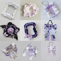
For example, a lavender theme can combine pale lilac cards, medium purple ribbons and a few deeper violet badges. A powder-blue display can use white or cream breathing room plus darker blue outlines or charms. The color family stays soft, but the shapes remain visible.
When you are unsure, take a quick phone photo and reduce the saturation. If the display turns into one uniform gray mass, add more light-dark separation.
Three easy pastel palette recipes
1. Pink + cream + cherry accent
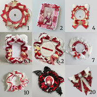
Use soft pink as the main field, cream as breathing room and a small amount of deeper red or berry pink around the focal merch. This works well for romantic, cute and character-focused collections.
2. Powder blue + white + navy detail
Keep most of the layout airy with blue and white, then use a few deeper blue details to define edges. This is especially effective for photocards because the darker accents help separate rectangular card shapes from the background.
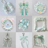
3. Mint + ivory + lavender
Mint and ivory create a calm base, while lavender adds a second pastel without turning the display into a rainbow. Repeat the lavender in only a few places so the eye can move around the layout intentionally.
Keep the focal merch stronger than the filler
Choose one to three pieces that should be noticed first, such as a favorite photocard, an oversized badge or a central acrylic charm. Give them more empty space, stronger framing or slightly deeper color around them. Smaller filler items can repeat around the focal area without competing with it.
If every piece has the same visual weight, the display may look busy even when the colors are soft. For more layout planning, see How to Plan an Ita Bag Layout and How to Make an Ita Bag Display Look Cohesive.
Match the bag color to the job it needs to do
A pastel bag can either blend with the collection or act as a quiet frame around it. If your merchandise already contains many colors, a softer neutral bag can calm the composition. If the merch is mostly one character color, matching the bag can create a stronger oshi-focused look.
You can compare more color approaches in the Ita Bag Color Guide, Pink Ita Bag Ideas, Blue Ita Bag Ideas and Purple Ita Bag Ideas.
Pastel displays work best with restraint
The strongest pastel layouts usually repeat a small number of colors, use contrast deliberately and leave enough breathing room for the collection to be read at a glance. Start with the hero merch, build a value hierarchy around it, then add decorative pieces only where they support the composition.
Browse all OshiHub ita bags if you are choosing a bag around a pastel collection.