
How to Build a Matching Accessory Set Around One Oshi Color
Share
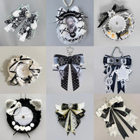
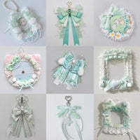
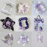
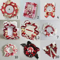
A matching accessory set does not mean every item must be exactly the same color. A more flexible system is to give each color a role and repeat those roles across different accessory types.
Step 1: choose the dominant oshi color
Pick the color most strongly associated with the character or the version of the merch you want to display. This becomes the main accessory color.
Step 2: choose one neutral
White, cream, black, gray, or clear are useful neutrals. They create separation so the dominant color does not fill every part of the window.
Step 3: add one optional accent
If the display needs more depth, choose a second character color, metallic accent, or lighter/darker shade. Keep it smaller in quantity than the dominant color.
Step 4: assign colors to accessory roles
For example: dominant color for photocard holders, neutral for badge frames, accent color for two ribbon bows. The set feels coordinated because the pattern repeats.
Step 5: test against the actual merchandise
The oshi color may already dominate the card art and pins. If so, use more neutral accessories so the collection does not become one flat block of color.
Step 6: limit decorative styles
Matching color is not enough if every accessory has a completely different visual language. Repeat a bow shape, frame outline, or material so the set feels intentional.
A simple 60/30/10 idea
You can roughly think of the accessory palette as mostly dominant color, a substantial neutral, and a small accent. The exact percentages do not matter; the principle is simply that one color should lead and another should support.
For building the overall bag palette, see How to Build an Oshi Color Theme.
Bottom line
A matching set is about consistency of roles, not perfect color matching. One dominant oshi color, one neutral, and one small accent are enough to coordinate holders, bows, rosettes, and fillers across the whole display.