
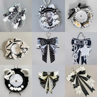
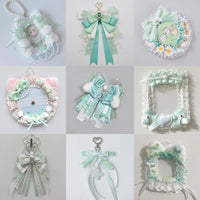
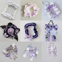
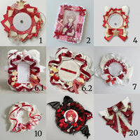
Cute vs Minimalist Ita Bag Layouts: Which Style Fits You?
Share
Cute and minimalist ita bag layouts can use the same pins, photocards and charms but feel completely different. A cute layout usually creates energy through layering, soft decorative details and repeated motifs. A minimalist layout gives fewer pieces more breathing room and relies on spacing, alignment and a clear focal point.
Neither approach is better. The right one depends on the size of your collection, the type of merch you own and how quickly you want the display to be readable through the clear window.
Cute layouts: layered, decorative and expressive
A cute layout works well when you enjoy bows, rosettes, ribbons, small charms, pastel accents and repeated character motifs. The display can feel full without looking random when the decorative pieces repeat colors or shapes already present in the main merchandise.
Start with one hero piece, then build outward. A photocard can sit in the center with badges around it, or an oversized badge can anchor one corner while smaller pieces create a loose frame. Use decorative fillers to connect the main items rather than filling every empty gap automatically.
If your collection already contains many colors, limit the supporting accessories to two or three repeated colors. That keeps the display playful while preserving a visual hierarchy.
Minimalist layouts: fewer pieces, stronger separation
A minimalist ita bag display uses empty space intentionally. Instead of trying to show everything you own, choose the pieces with the clearest artwork, strongest emotional value or best color relationship.
Give each focal item a visible boundary. A single photocard with two badges and one charm can look complete when the spacing is deliberate. Symmetry can make a small collection feel organized, but an asymmetrical layout can also stay minimal if the visual weight is balanced.
Minimalist displays are especially useful when the clear window is small, the merch has detailed artwork or you want the bag itself to remain part of the composition.
Compare the two styles
- Merch density: cute layouts usually show more pieces; minimalist layouts use fewer.
- Accessories: cute layouts often benefit from decorative holders and fillers; minimalist layouts usually keep them restrained.
- Color: cute layouts can support several coordinated colors; minimalist layouts often feel strongest with a tighter palette.
- Focal point: both need one, but it is more obvious in a minimalist display.
- Maintenance: fewer pieces are generally faster to rearrange, while layered displays may take longer to rebuild.
Choose based on your actual collection
If you own only a few favorite pieces, do not force a dense layout. Use the available space confidently and let the collection grow over time. See Ita Bag Layout Ideas for Small Collections for more ways to work with limited merch.
If you already own many badges and charms, a cute layered display can make better use of the window. For larger collections, see Ita Bag Layout Ideas for Large Collections.
You can combine both styles
A display does not need to be purely cute or purely minimal. One practical hybrid is to keep the center clean and use decorative details only around the perimeter. Another is to make one dense character cluster while leaving the rest of the insert quiet.
Before attaching anything permanently, test the layout flat on the insert and photograph a few versions. The planning method in How to Plan an Ita Bag Layout makes comparisons easier.
For more inspiration, compare Kawaii Ita Bag Ideas, Minimalist Ita Bag Ideas and How to Make an Ita Bag Display Look Cohesive.
Browse all OshiHub ita bags when you are choosing a window size and carry style for your preferred layout.