
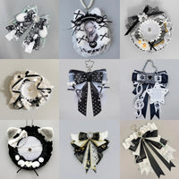
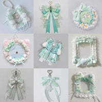
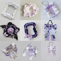
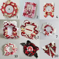
Pinterest Photo Ideas for Ita Bags
Share
Pinterest works especially well for ita bag content because collectors often search visually for layout ideas, color combinations, bag shapes and ways to display specific types of merchandise. A useful photo should communicate one idea quickly even before someone reads the caption.
1. Full-bag hero photo
Show the entire bag with the display clearly visible. Keep enough space around the silhouette that the image can be cropped vertically without cutting off straps or important accessories. Use a simple background and make the bag the largest visual element.
2. Before-and-after layout
Photograph the insert before arranging it, then photograph the completed display from the same angle. This format turns a pretty image into a useful transformation and helps collectors understand how the finished density was built.
3. One-color theme
Create a photo around one strong color family: pink, blue, purple, black, red or a softer pastel theme. Keep the props secondary so the bag and merchandise still carry the color story.
For layout planning, see How to Match Ita Bag Color to Your Merch Collection.
4. Detail close-up
Photograph one useful feature rather than the whole bag: a mesh insert, photocard holder, badge cluster, zipper, rosette or charm attachment. Close-ups work best when the viewer can immediately tell what detail they are meant to notice.
5. Capacity comparison
Show the same insert with a small, medium and dense arrangement, or compare how different badge sizes affect capacity. Keep the camera position consistent so the comparison is easy to read.
The OshiHub Pin Capacity Calculator can help estimate how many badges may fit before you build the visual.
6. Outfit plus bag
Use a wider lifestyle photo where the bag is worn naturally, then make sure its display window remains visible. Coordinate one clothing or accessory color with the bag rather than matching every item.
See Ita Bag Outfit Ideas for styling approaches.
7. Flat-lay planning photo
Place the empty insert, selected merch and a few supporting accessories on a clean surface before assembly. This makes the planning process visible and creates a different type of image from the finished bag.
8. Three-layout comparison
Use the same collection to show three arrangements: symmetrical, asymmetrical and centered around one hero piece. Consistent framing makes the differences obvious and gives viewers a reason to save the image for reference.
9. Collection-growth photo
Document the same bag at different stages as the collection grows. A small collection does not need to look unfinished when spacing is intentional. The progression itself becomes useful content.
10. Problem-and-solution visual
Show one common display problem and the corrected version: glare, overcrowding, weak focal hierarchy or an insert with too much empty space. Keep the visual simple enough that the improvement is obvious without a long explanation.
Build each photo around one search intent
Do not try to communicate color inspiration, capacity, styling, cleaning and layout technique in one image. One clear concept gives the photo a stronger reason to be saved and makes the accompanying title more specific.
Keep the product accurate
If you edit the image, preserve the real bag color and construction. Avoid filters or generative changes that move windows, alter straps or make the actual product look different from what a buyer would receive. See How to Edit Ita Bag Photos Without Changing the Product Color.
For shooting basics, see How to Photograph an Ita Bag With Your Phone.